Audio Guide
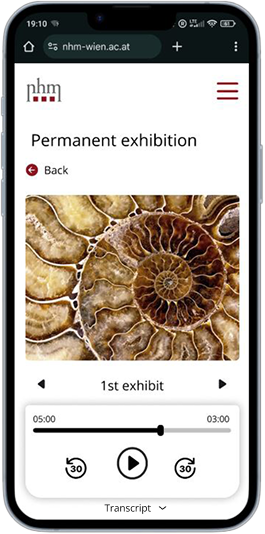
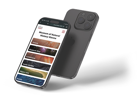
Mobile Website
This conceptual product is designed to be used for ticket purchase and finding information about the museum and its exhibitions during a museum visit.
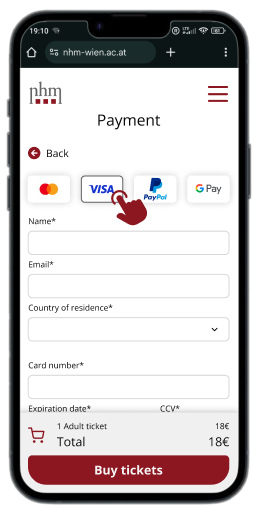
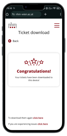
34% faster mobile checkout flow
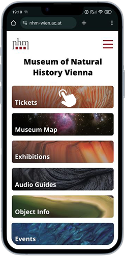
The ticket checkout is now 34% faster (1:26 min). It now takes 2.46 min, instead of the 4.11 min average of the current site.
During a museum visit, accessible by scanning a QR code at the museum entrance. The users will be able to buy tickets with it and access additional information on the exhibitions, artefacts and events.
Because that's what the people want. All interviewed users said that they didn't want to download an app ''just to use it once''. Having to go through fewer steps to access the product makes it less likely the users will abandon the task in the overwhelming environment of a busy museum.
Average checkout time for ticket buying – 2.47 min (34% less)
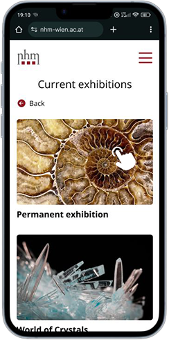
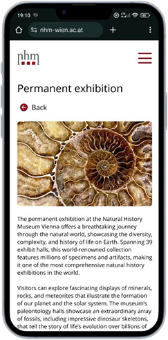
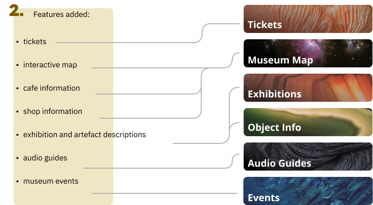
Audio Guide
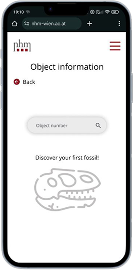
Artefact annotations
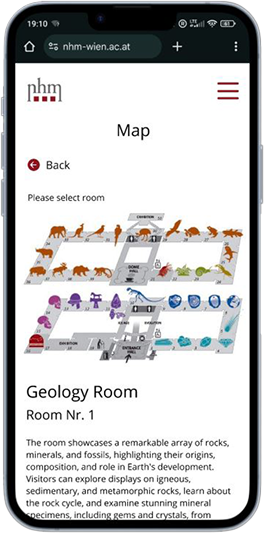
Museum Map
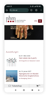
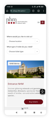
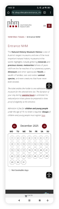
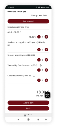
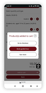
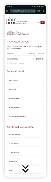
The current website isn't mobile optimized, the ticket buying is slow
The new design makes mobile ticket buying a lot easier and faster
It's hard to read annotations in the dark museum
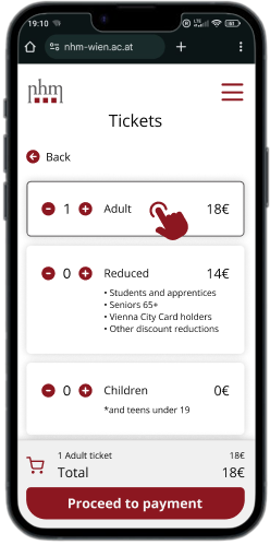
The new site offers people to read annotations on their phone
There is a need for additional information on museum artefacts
The site would allow museum goers to access the information
The museum relies on printed pamphlets to convey information which isn't very ecological
The site would eliminate the need for printed pamphlets and make the museum more environmentally friendly
The secondary research determined 5 main user demographics

1. Families

2. Tourists

3. Educated Adults

4. School Groups

5. Older Adults
Overview
x5, 30 min structured video interviews were conducted on regular museum goers to explore their museum visiting habits. The participants (25 – 55 y/o) were selected to represent all the target audience groups.
Goal
The interviews were conducted to explore the participants museum visiting habits.
Impact on Design
Make a mobile website, rather than an app.
This also dramatically reduces the costs of development.

Louise
User Story
Louise is studying for a master's degree in history and works part-time at a book store so she has to manager a tight schedule and limited funds. Due to her studies she visits museums regularly, and she loves to take her partner with her whenever she can.
Quote
"My hobby is to learn through entertainment!"
Problem Statement
Louise is a working student who needs access to exhibit information outside the museum's working hours because of her tight schedule.
Goals
Pain Points

Markus
User Story
A young professional who visits the natural history museum as a science enthusiast with his family. He prefers the quieter hours since that is less stressful for his young son.
Quote
"I like to show my son the wonders of the natural world."
Problem Statement
Markus is a young father who needs more access to exhibit information to answer his son's every question.
Goals
Pain Points

Hannah
User Story
Hannah is enjoying her retirement by travelling and visiting museums with friends and family. She loves reading about exhibits, but her farsightedness makes it difficult.
Quote
"Now that I'm retired, I finally have the time to travel and see the world!"
Problem Statement
Hannah is a retiree who needs exhibit information in audio or digital text form because of her poor eyesight.
Goals
Pain Points
without the mobile website

Persona: Louise
Goal: Visit a museum
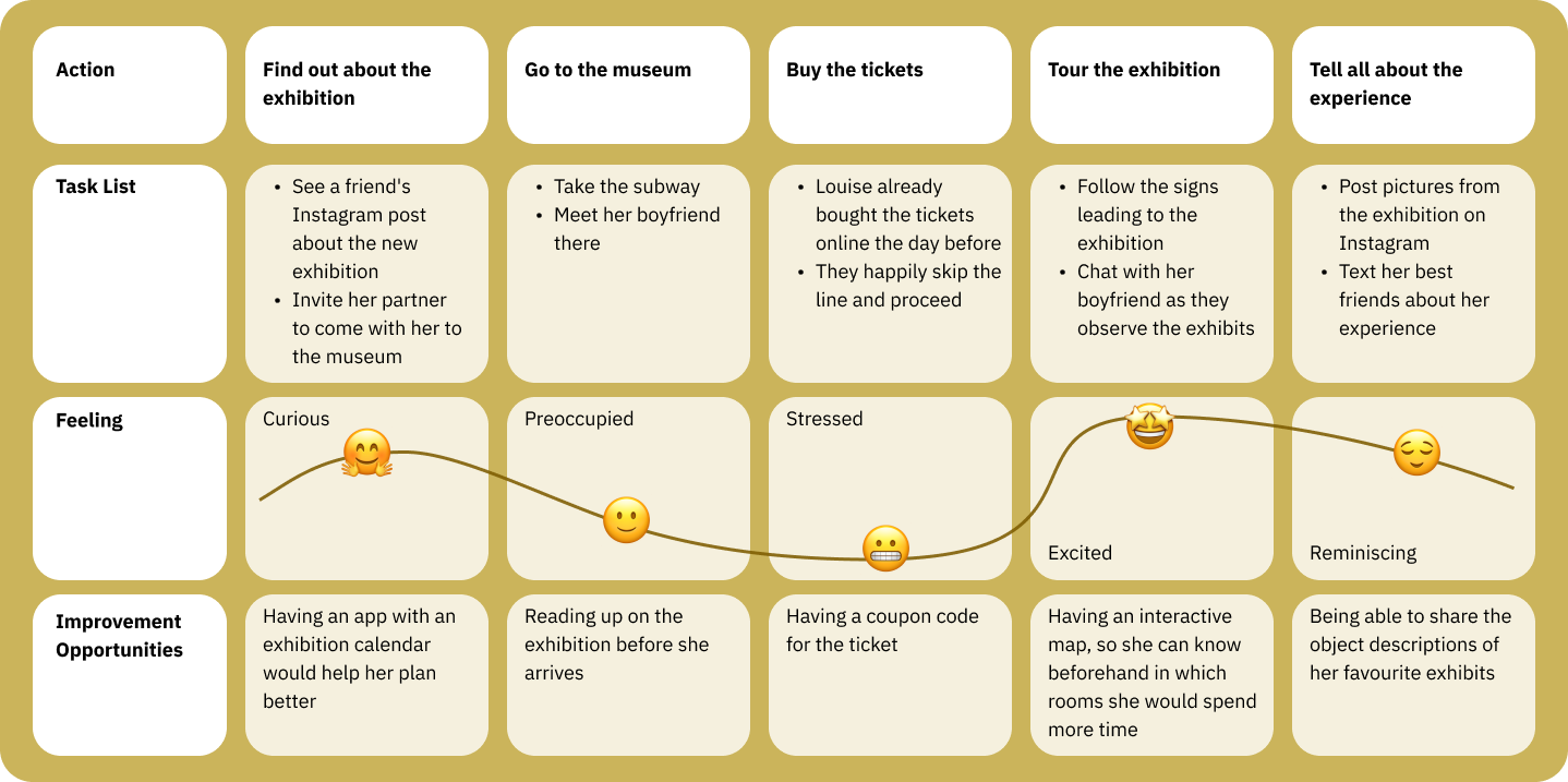
with the mobile website
Scenario: Louise visits the Museum and discovers the exhibits.
1.Entry & Ticket buying
2.Object Information
3.Exhibition description
4.Audio guides
5.Museum Map
6.Events
 |
 |
 |
|
|---|---|---|---|
| Target audience | Families, male oriented | Culture enthusiasts, art students, families | Families, culture enthusiasts |
| App store rating | 2.1 | 4.4 | 4.5 |
| Unique value proposition | Comprehensive factual info on exhibits of the Vienna Technical Museum. | Intuitive app with various audio tours of Weltmuseum exhibitions. | Audio tours tailored to adults, children, and families at the Art History Museum. |
| Strengths | Many functions: audio tours, exhibit catalogue, map, events, object search, favourites. Intuitive navigation. | Visually impressive. Simple user flow. Does the few things it does well. | Good visual design. Very simple user flow. |
| Weaknesses | Technical glitches explain the low rating. Lacking visual design. | No reading material. Must download whole audio guide to read its description. | Many functions don't serve a purpose. |
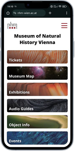
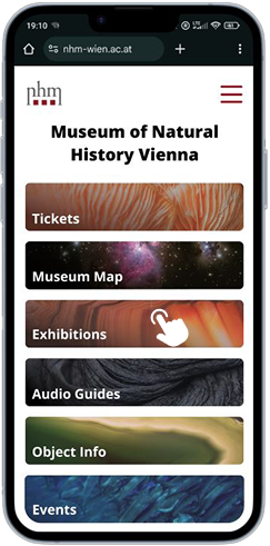
The word 'Map' was confusing so it was changed to 'Museum Map'
'Current exhibition' and 'Exhibit information' were too similar, so the latter was changed to 'Object Info'
All menu items were above the fold
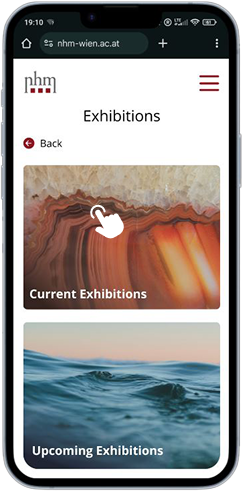
Current and upcoming exhibitions combined in one menu item
The Visit Us section was removed from the hub menu, since it is less necessary in the use case
"The design is very intuitive."
said the user test participants
Everyone said that they can imagine themselves using the website instead of the traditional information sources such as pamphlets and physical audio guides.
Visit Us
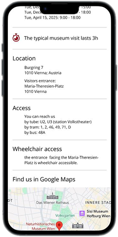
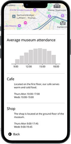
Typical museum attendance duration
The Visit Us section link was added at the end of every event and upcoming exhibition
Wheelchair access
A Google maps shortcut
Average museum attendance
Shop and cafe information
Exhibitions & Current exhibitions
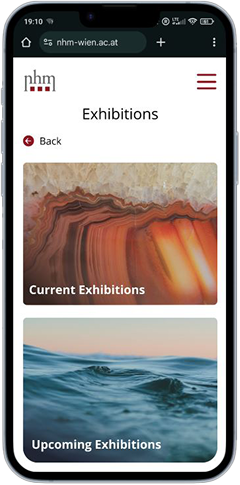
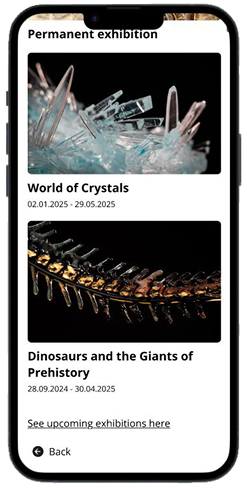
Back button added at the top
Exhibitions page added
Link to the future exhibitions added
All events & Event
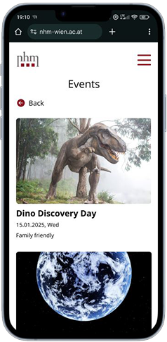
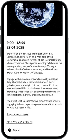
Day of the week added
Family friendly note added
Link to the ticket page & visit us added