E-Commerce Checkout UX Audit
Kofferwelt.at
Kofferwelt is a small e-commerce store based in Vienna, Austria, that sells suitcases, bags and schoolbags.
Jan 2024
82 UX issues found in checkout audit

Impact
According to the research findings of the Baymard Institute the average cart abandonment rate is 70.19%.
Following their 116 guidelines and best practices reduces the cart abandonment by 35% on average.
Methodology
Evaluation dimensions:
- Usability
- Trust
- Error handling
6 pages audited:
- Cart page + cart sidebar overlay
- Login page
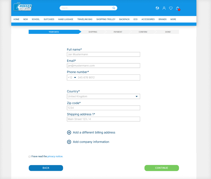
- User data input page
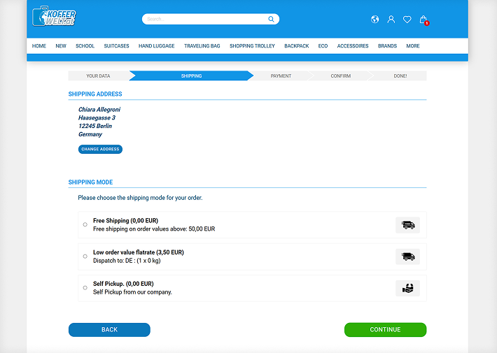
- Shipment page
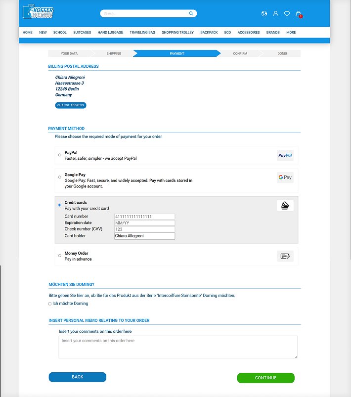
- Payment page
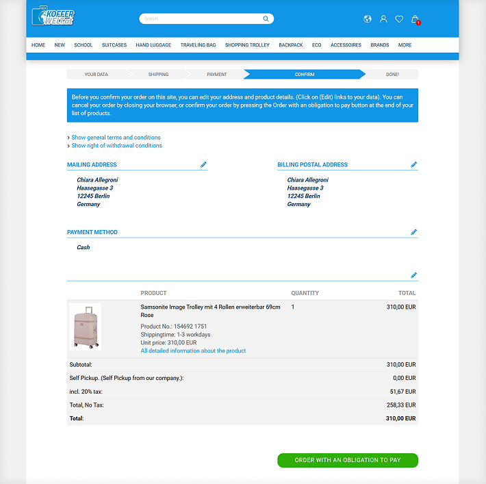
- Order confirmation page
Scope:
Desktop checkout flow UX audit
Method:
Benchmarking against Baymard institute guidelines
Deliverables:
Report and prioritized recommendations
Timeline:
Jan 2024
Benchmarking
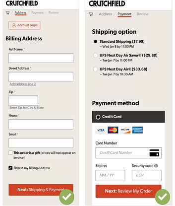
A checkout flow can be as simple as 7-8 input fields
- Full name
- Phone number
- Address line 1
- Credit card number
- Expiry date
- Security code
User scenario

As a customer Mrs. Toledo wants to buy 2 new backpacks and a large suitcase for a family trip to Spain.
Problems Mrs. Toledo encounters in the checkout?
- The bags she picked out disappear from her cart after she tries to find a discount coupon in Google
- She has trouble understanding some of the terms used in the checkout
- She makes a mistake typing her email and she can't seem to change it
- She needs the package delivered to her office and she has trouble adding a different shipping and billing address
Report summary
82 issues in total across 6 pages
1. Unforgiving checkout experience
- Cart items auto-clear and user data expires within an hour , with no save option
- Customer data becomes uneditable after the first input step
2. Not enough error detection
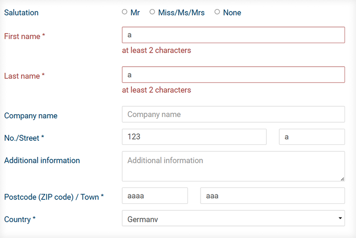
- Obvious errors , like letters in the zip code field , go uncaught throughout checkout
3. Many redundant elements
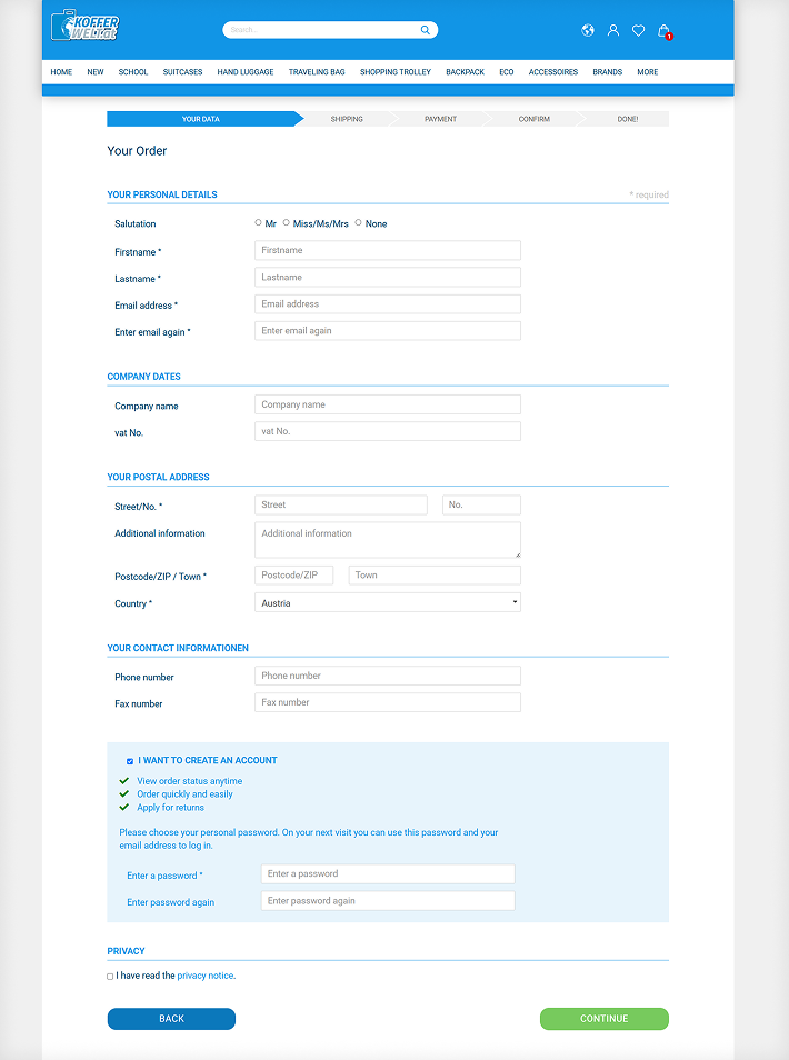
- 25 input fields could be trimmed to 8 , the rest cut or hidden under accordions to reduce cognitive load
- Duplicated and repeated text adds friction throughout the flow
4. Too many steps
- The checkout has far more pages than it needs
- Users can edit some fields through multiple paths, but other fields can't be edited at all
5. Language mistakes
- Misspellings and wrong terms , "Fullname", "Money order" (meaning bank transfer) , erode trust and make the site look illegitimate
- Parts of the English version are still in German
Detailed audit report

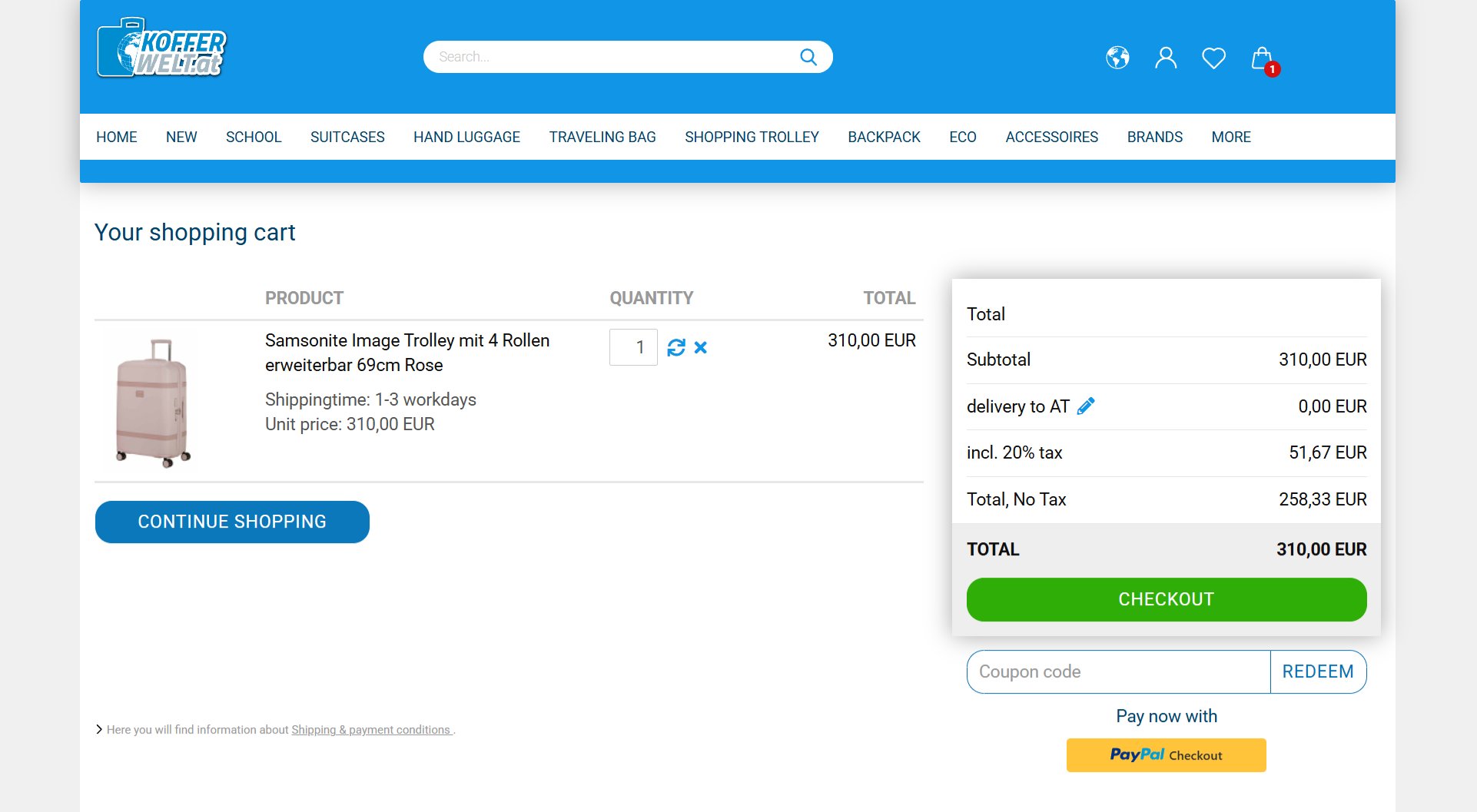
Items automatically vanish from the cart
Cart items expire on an unspecified timer and aren't saved to favourites. Combined with weak search, users can't recover lost products.

Adding to cart discourages from browsing
"Add to Cart" jumps straight to the cart page instead of opening a side drawer, breaking the browsing flow.
Items can only be added from product detail pages , not from listings , forcing extra navigation.
@
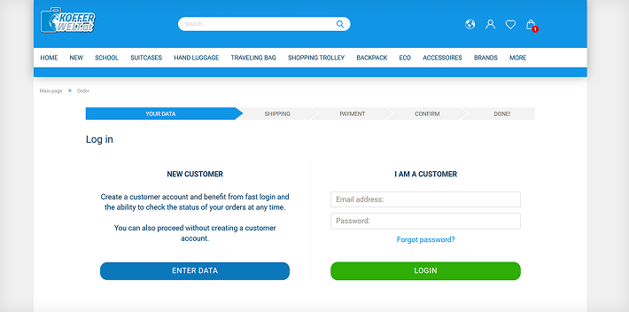
It's not possible to edit the email address after this step

There are too many visible input fields
Error recovery
Page redesign
Yes, it could look so simple