For years I've been mis-tapping in Brave at exactly the same spot, and honestly there's a mistake behind it that costs online shops sales every single day.
The browser shows its menu bar twice, once at the top and once at the bottom. On sites like YouTube, which have their own bottom menu, you then get two bars sitting right on top of each other, and I reliably reach for the wrong one.
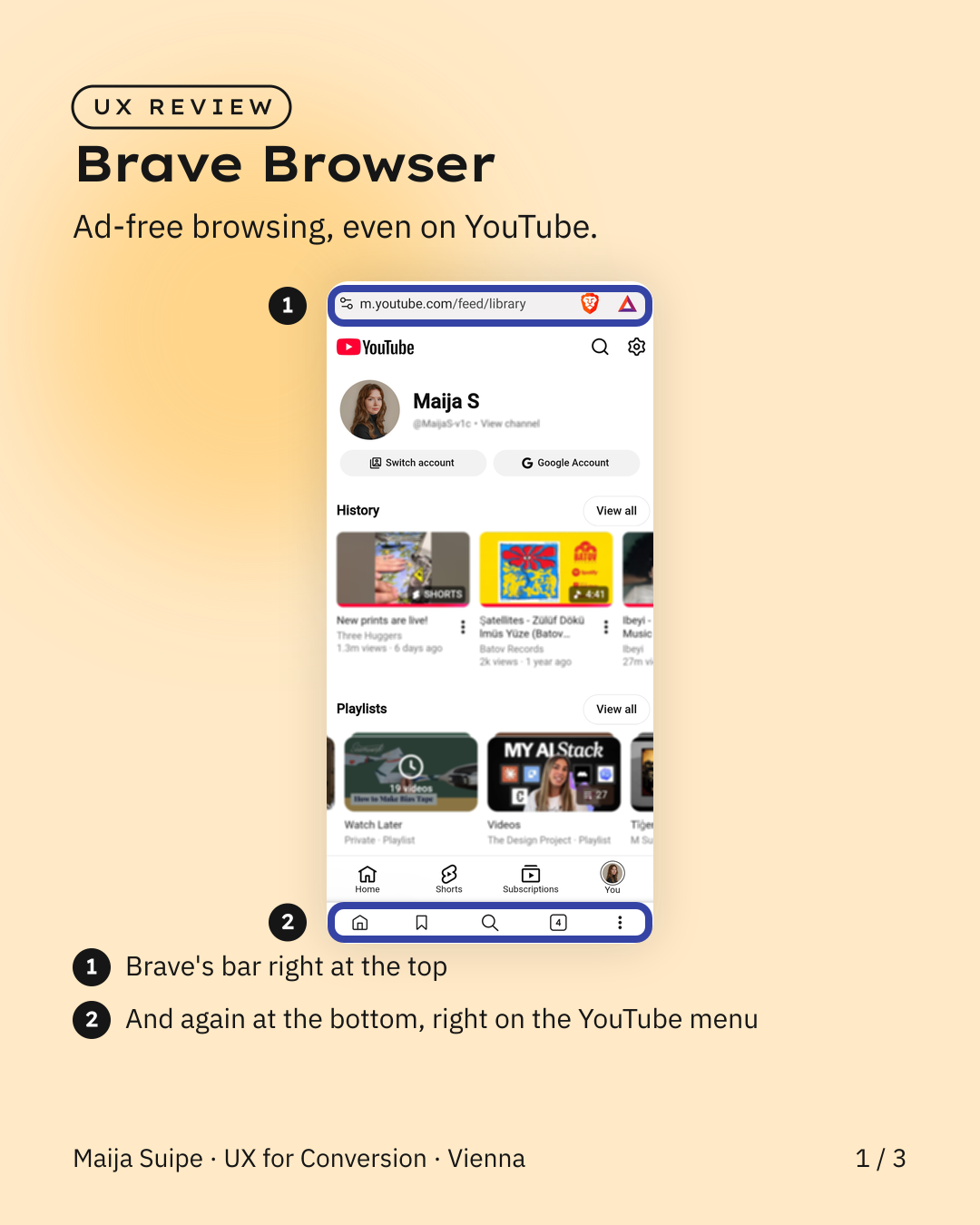
Sounds like a triviality, but it's a pattern that really hurts in e-commerce.
Because on mobile, the bottom edge is the most valuable strip of the whole page. That's where the thumb sits, and that's why the most important actions live there, cart, checkout, pay. But that's also exactly where sticky buttons, cookie banners, chat windows and the next sale banner all crowd in at the same time.
And every time two things overlap down there, someone taps the wrong one. In a browser that's annoying, in a shop it's an abandoned purchase.
The fix is simple: the bottom belongs to exactly one clear main action, everything else moves aside or fades out as you scroll. Then the most important button sits free, right where the thumb expects it.