This week I took a look at About You, and honestly, it took me quite a while to even find something to criticize.
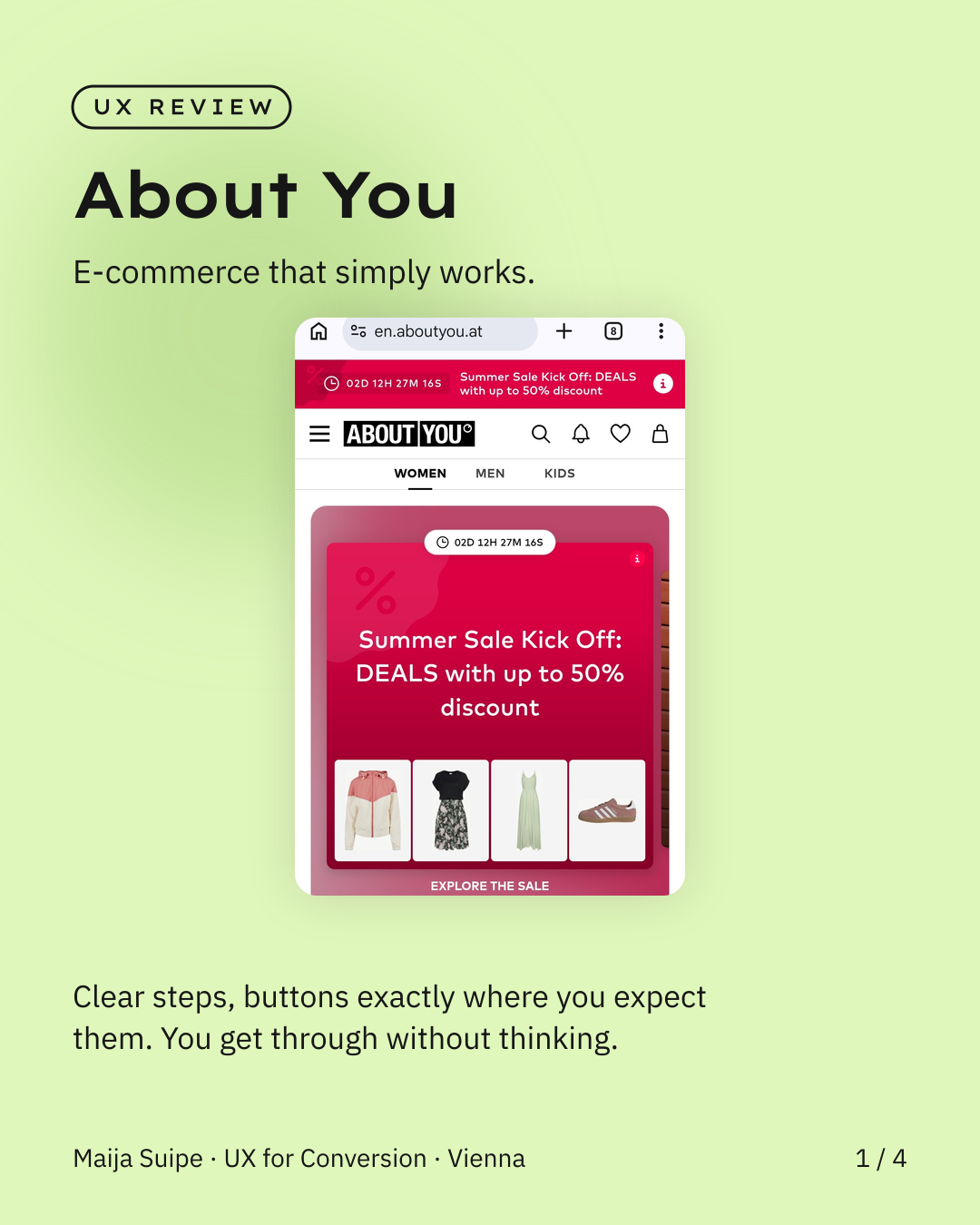
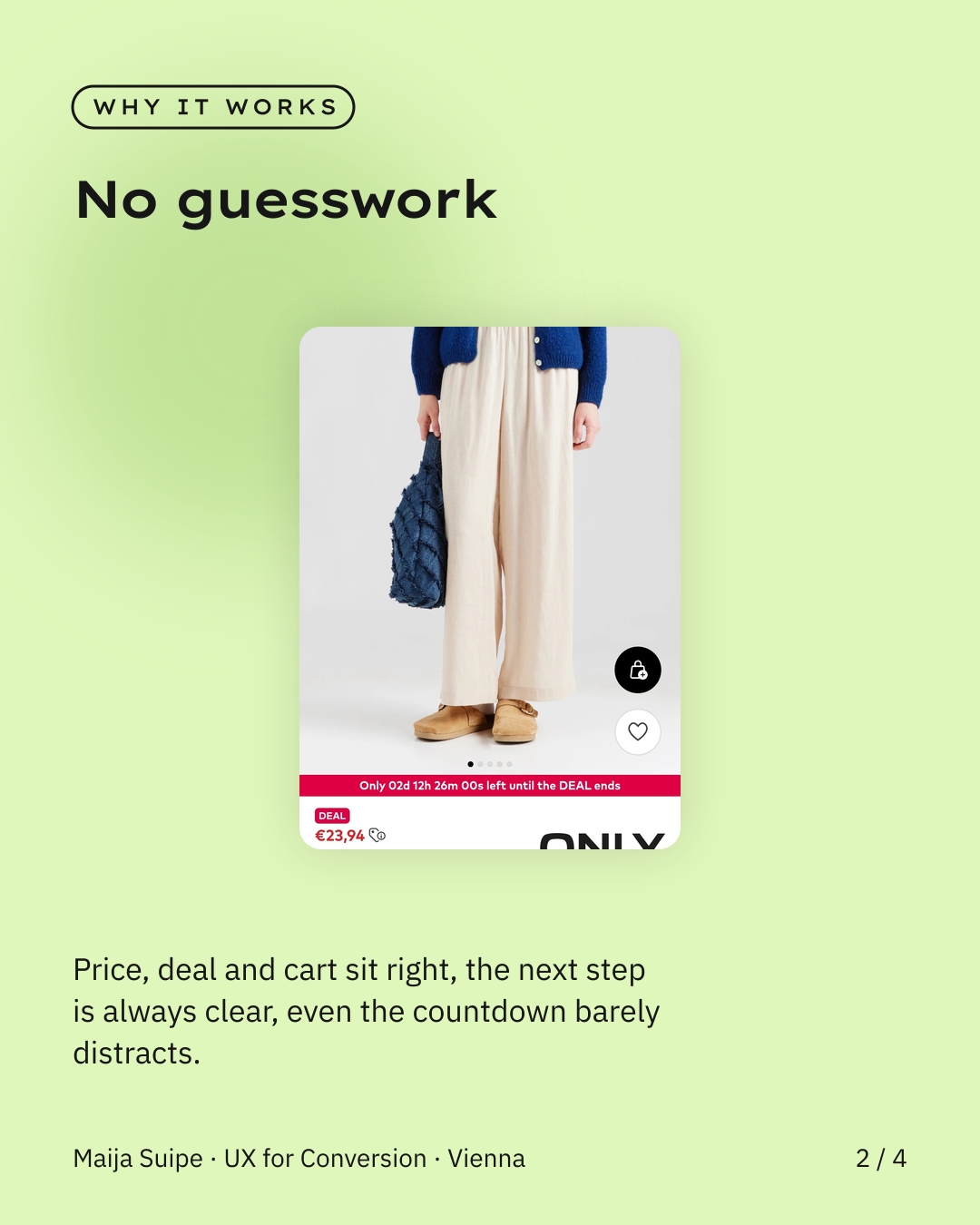
The whole flow just sits right. The buttons and the next step are exactly where you expect them, so you move through the shop without really having to think. And the nice part is that even the countdown building pressure at the top of the page barely distracts from the actual goal, because the path to purchase is so clear.
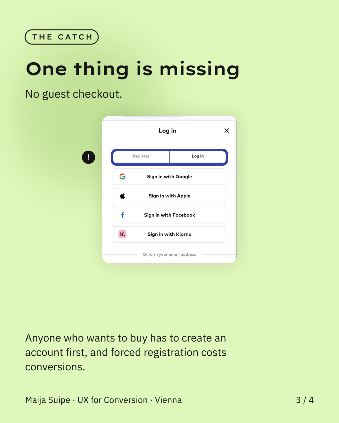
The only real UX flaw I found in the end is that there's no guest checkout. Anyone who wants to buy has to register or log in first, and that forced account creation is one of the most common reasons people end up abandoning the purchase after all.
And that's the interesting part: it would only be a small addition, one step less to the purchase, but from user research I'm pretty sure that exactly this kind of thing lifts conversion noticeably.
Nice to see that good e-commerce craft is no rocket science, and that in the end it's often a single little thing that decides between a visit and a sale.