Did you know that on the Swiss railway's site you find the setting to hide ticket prices faster than the actual train departures?
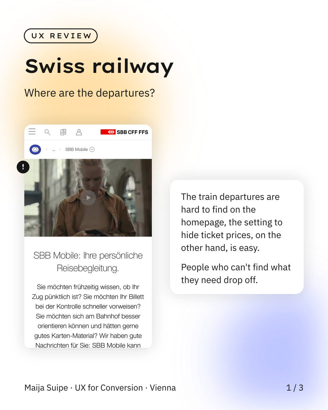
Out of pure curiosity I took a look at the mobile presence of SBB this week, the Swiss railway.
And the good news first, the interface is noticeably more polished than ÖBB or DB, really nicely done visually, it's just that the user experience is unfortunately pretty confusing in places.
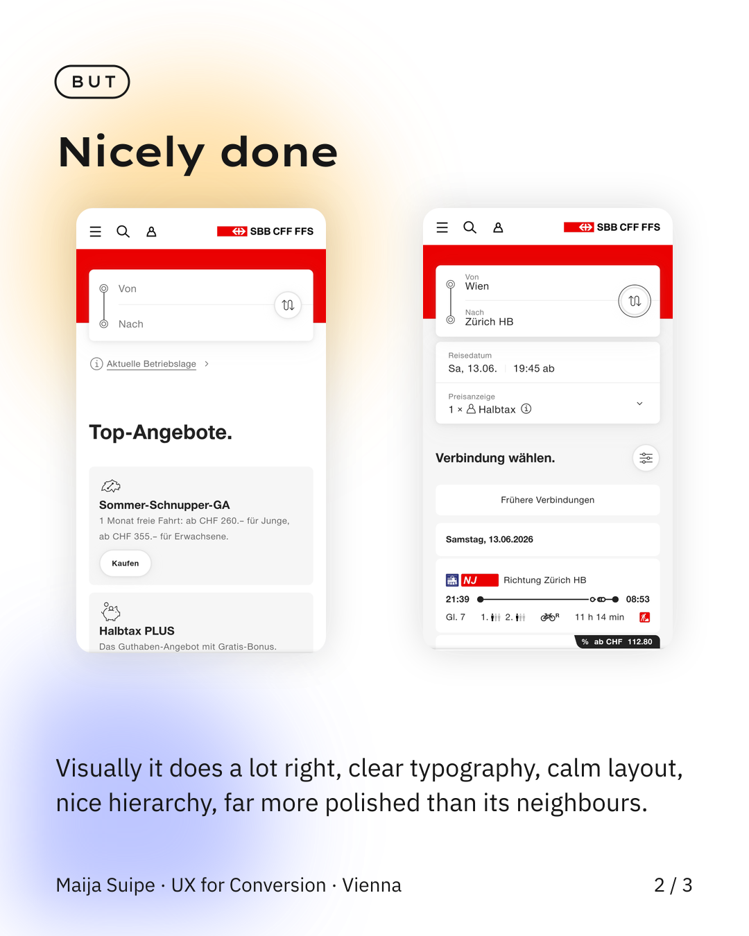
The best example is that it took me almost two minutes to get from the page I landed on via Google to the departures at all, and can you guess which button was the right one, it was the home icon in the top left, of all things the symbol you'd normally assume keeps you where you are and doesn't suddenly send you off to a completely different page, though the real mistake is probably even earlier, namely that Google links straight to the wrong subpage.
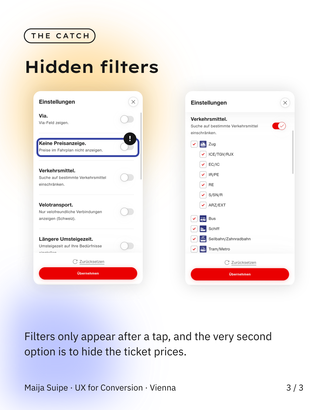
The other thing that stands out is the filters, because first you have to tap the filter icon, then a list opens where you have to expand something extra just to get to important settings like the mode of transport, and the really funny part is that the second option in the whole list is actually to hide the ticket prices, which I find the most Swiss thing imaginable, probably a side effect of simply earning too well.