Thalia's mobile shop actually isn't bad at all, and still I sat down and drew my own version of the homepage.
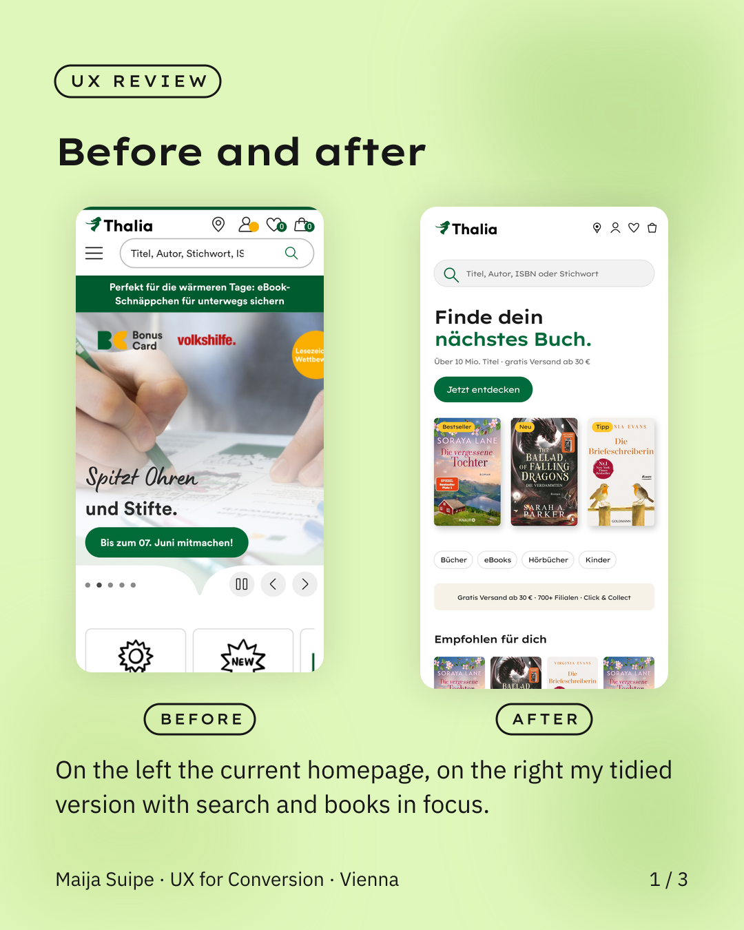
Thalia does a lot right, but considering the target group is relatively young and almost entirely on mobile, there's still plenty of room to improve, because the current homepage overwhelms you pretty quickly, with promotions, logos and banners all fighting for attention at once.
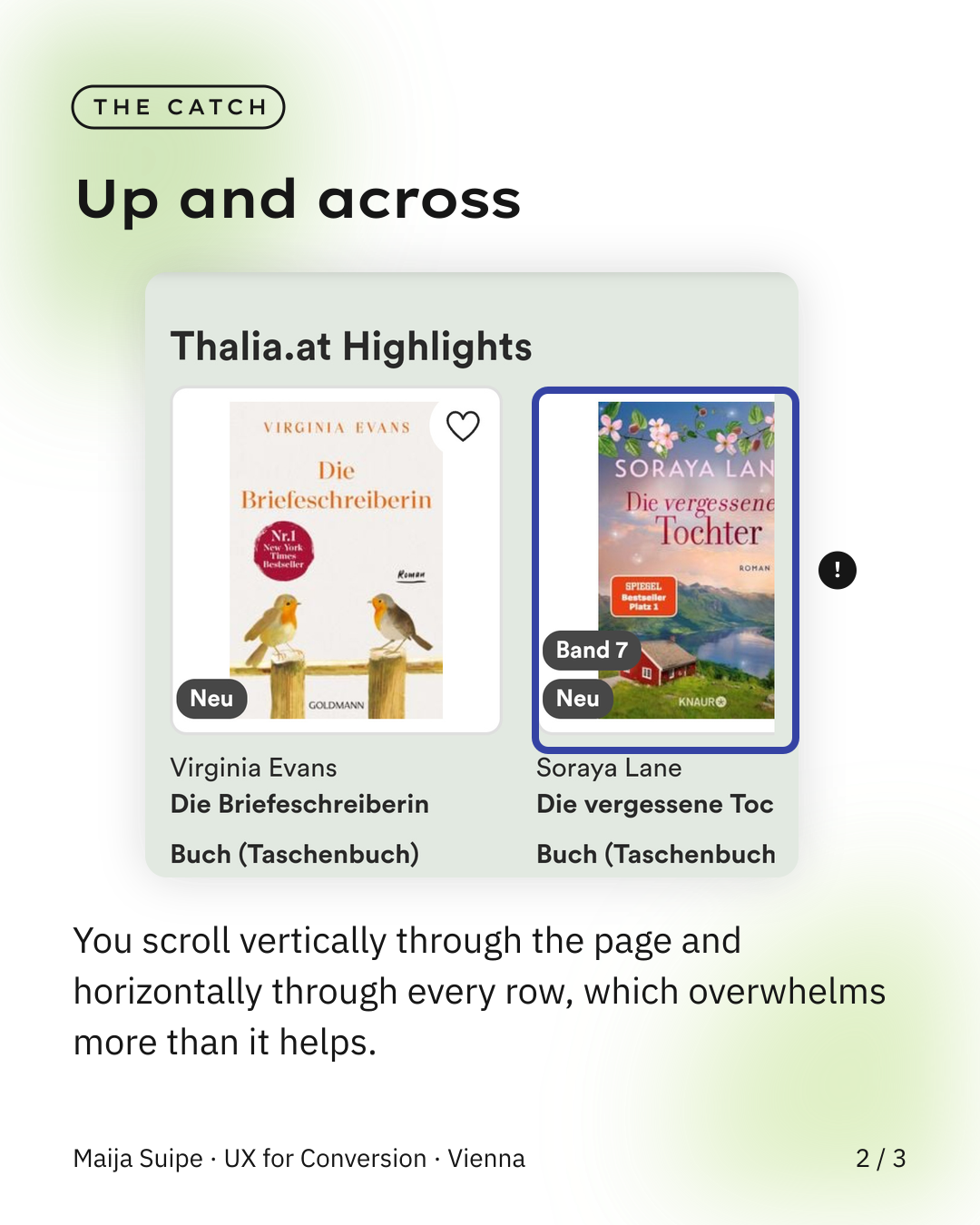
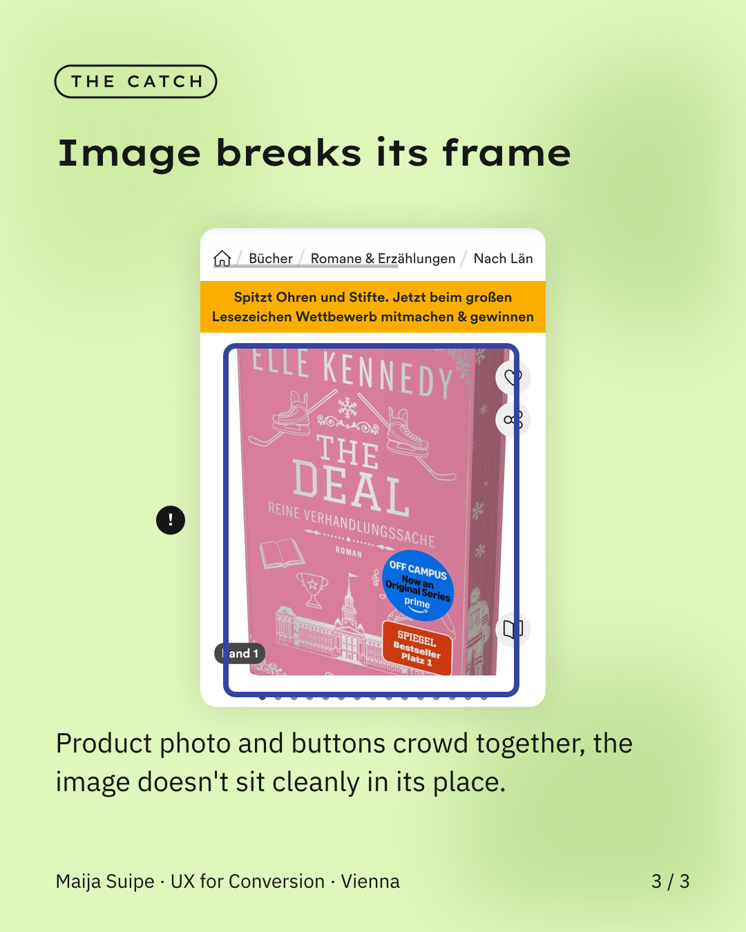
What stands out to me in particular is that while browsing you have to scroll both vertically and horizontally, and that's exactly what makes it exhausting, because you never really get the feeling of having an overview, it's basically the paradox of choice in its purest form, and on top of that the product photos often don't sit cleanly in their place, which adds to the restless impression.
So I made a quick sketch of what a calmer and more stylish homepage could look like, with search at the center, a clear focus on the books and just one message instead of ten.
And that's not just a matter of taste, because a tidier, calmer design would translate pretty directly into more sales with a young, mobile target group like this, especially into more impulse buys, because a relaxed mind reaches for things more readily than an overwhelmed one.